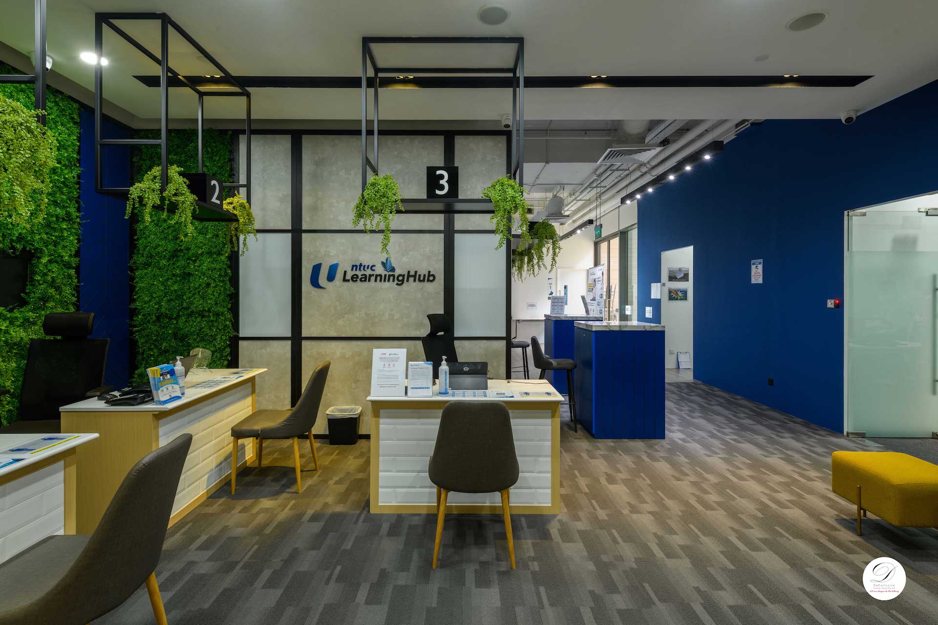
NTUC Learning Hub Eunos
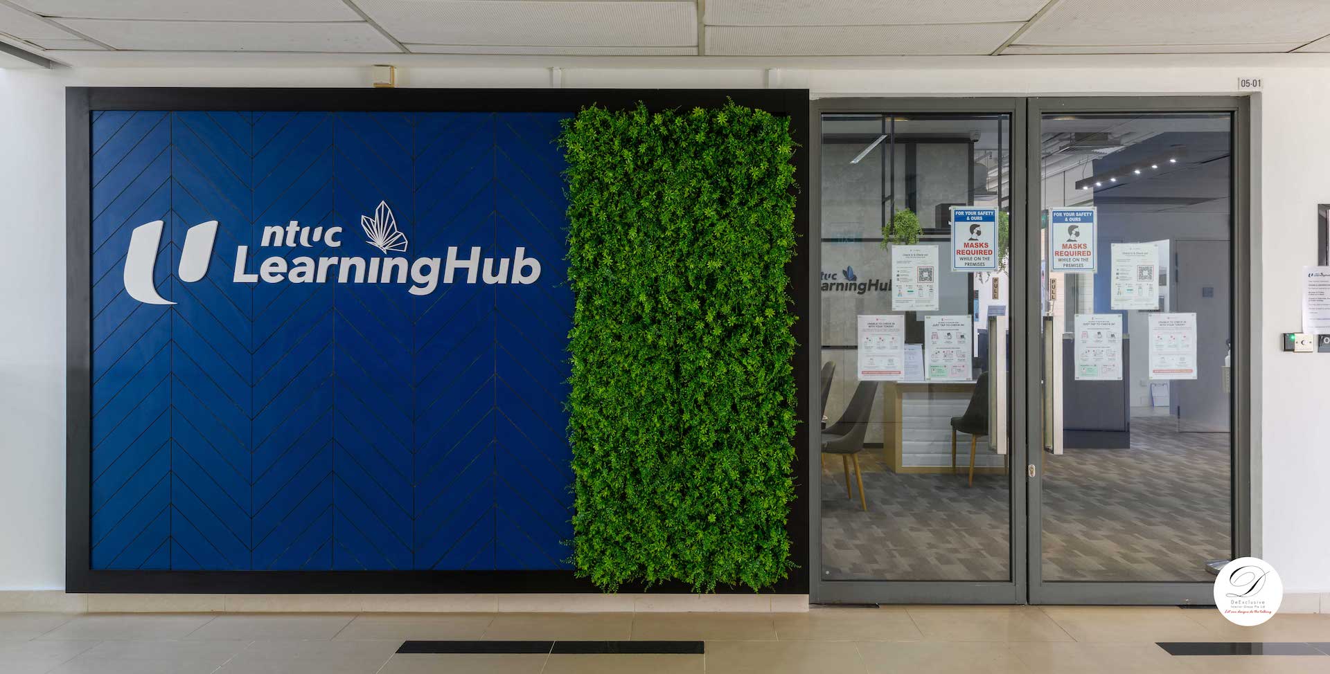
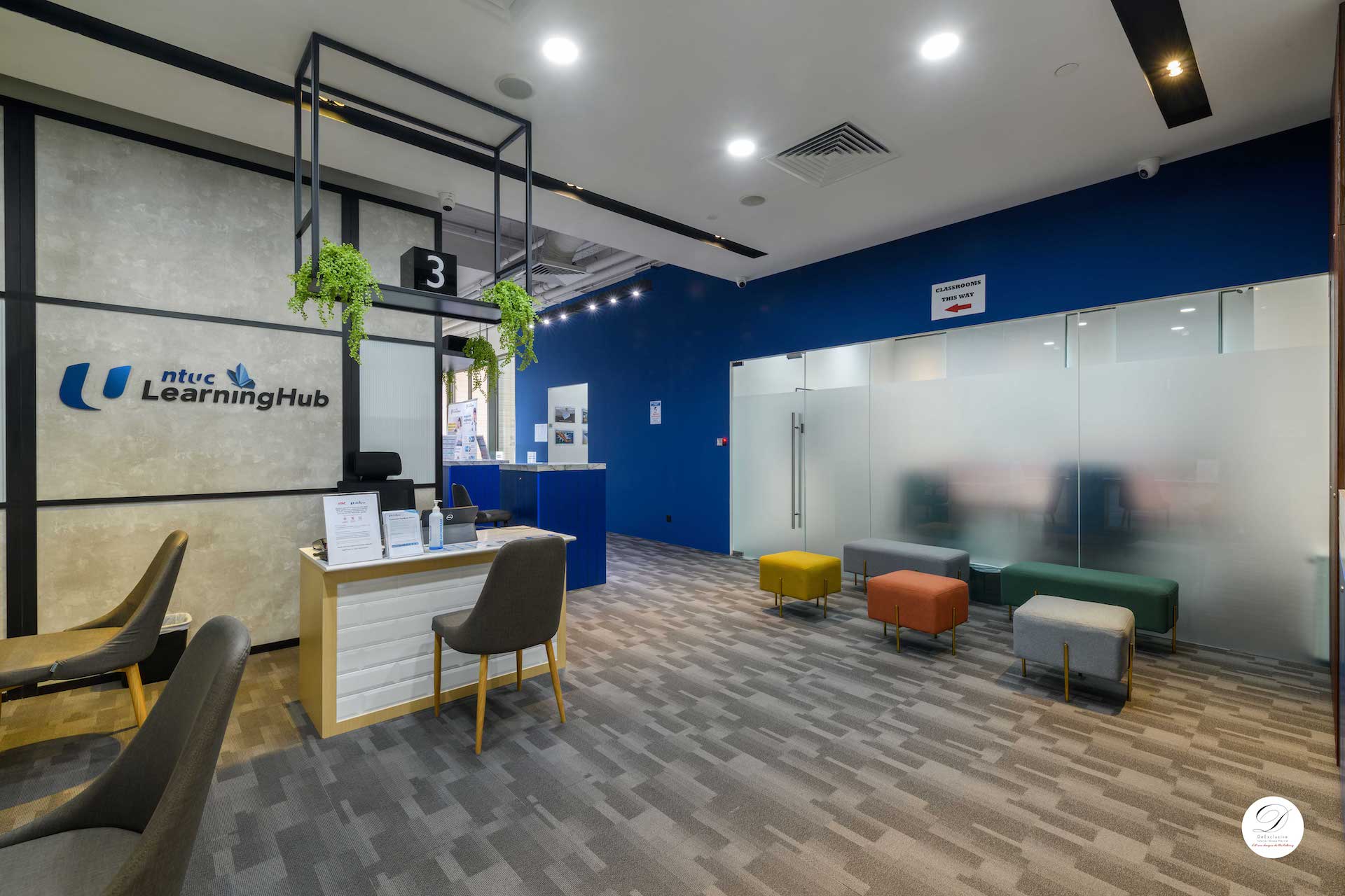
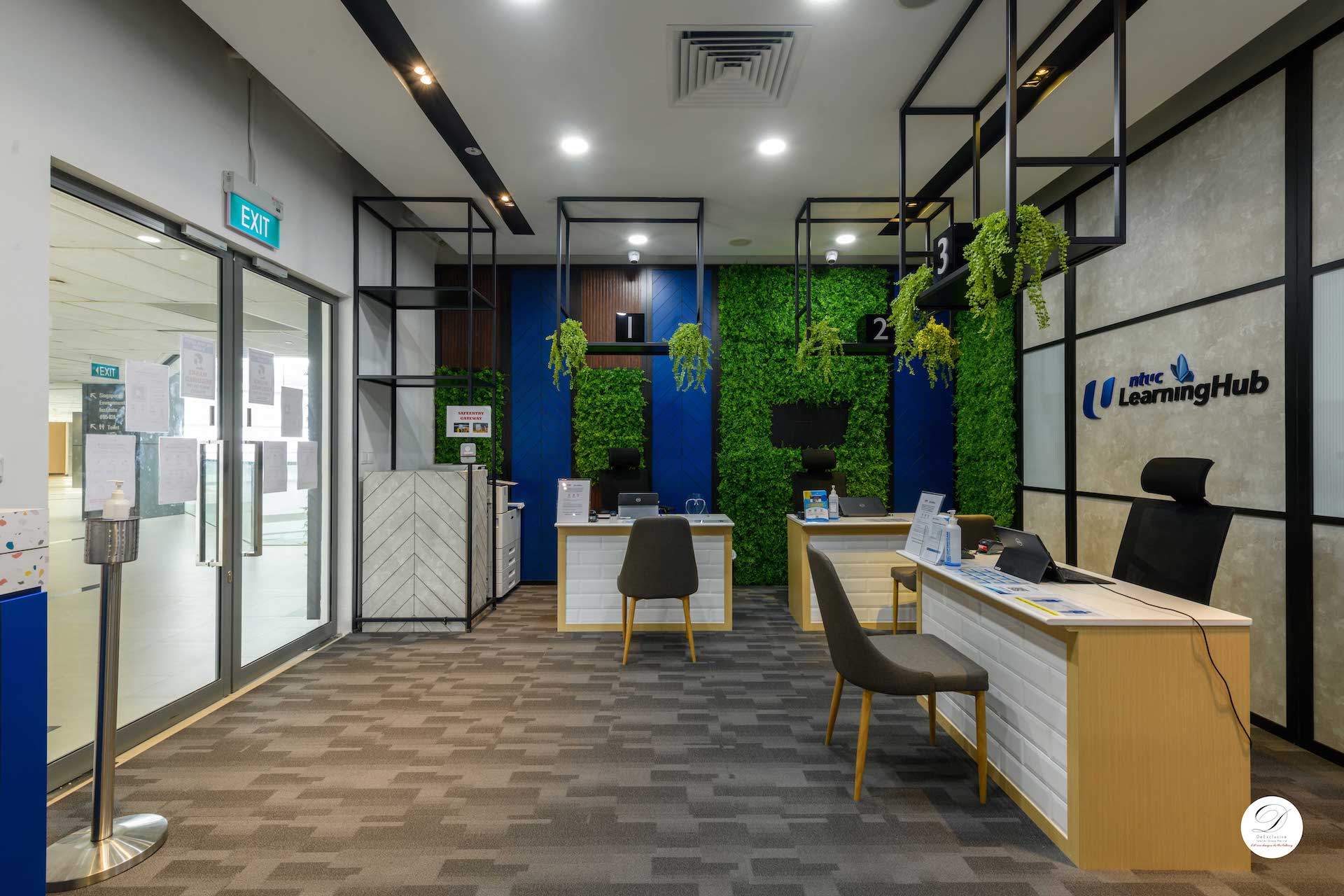
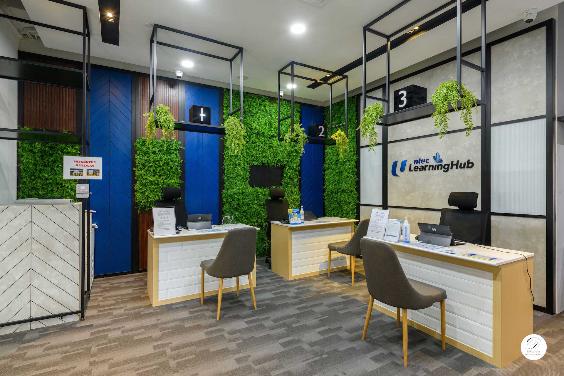
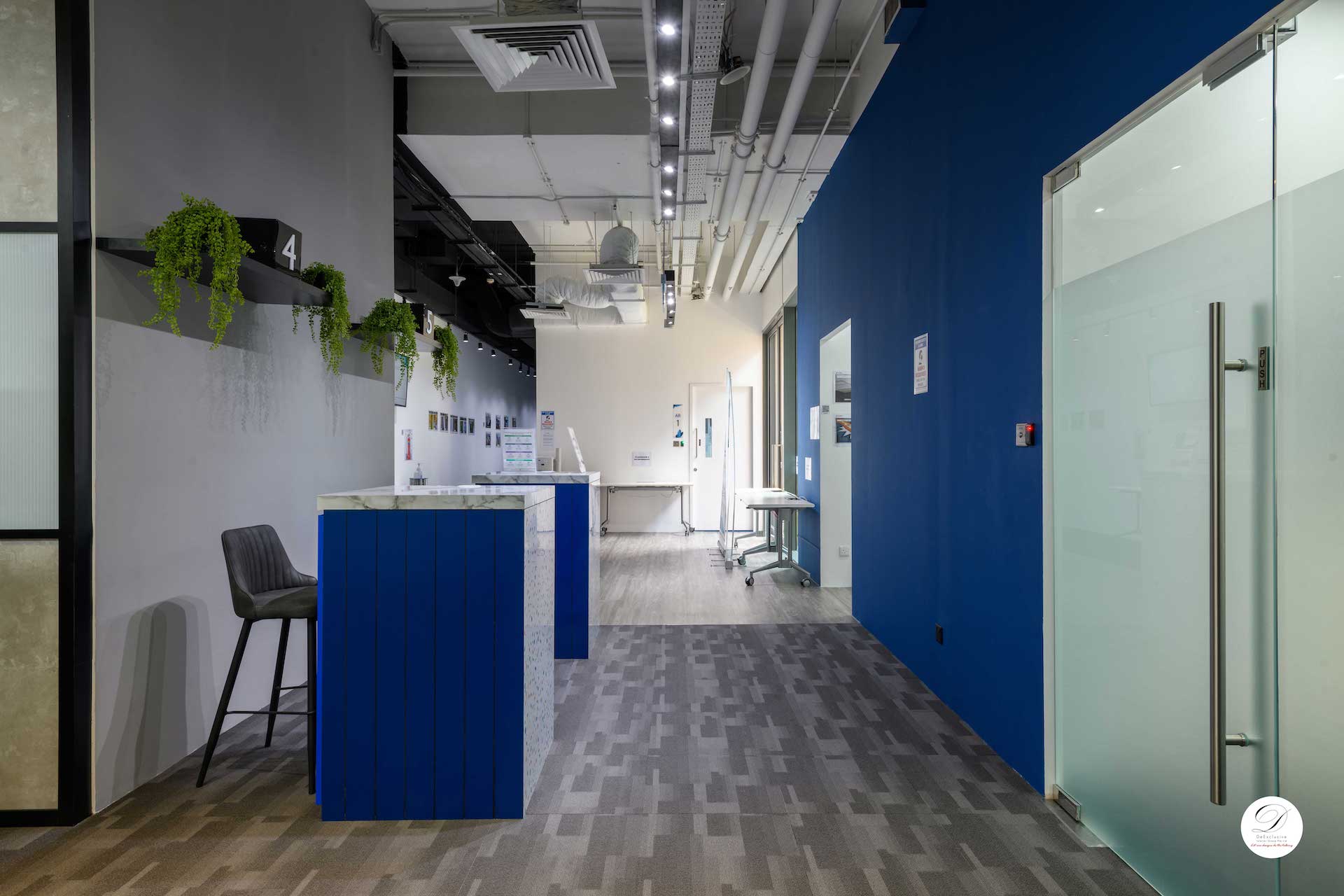
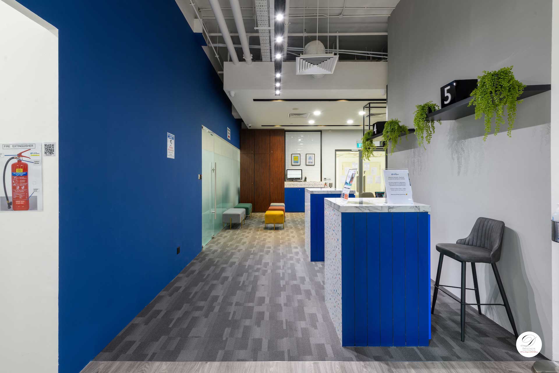
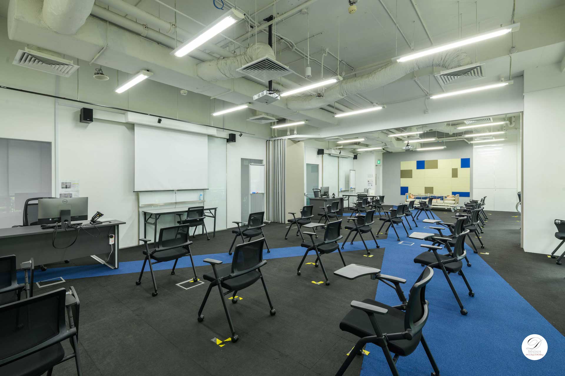
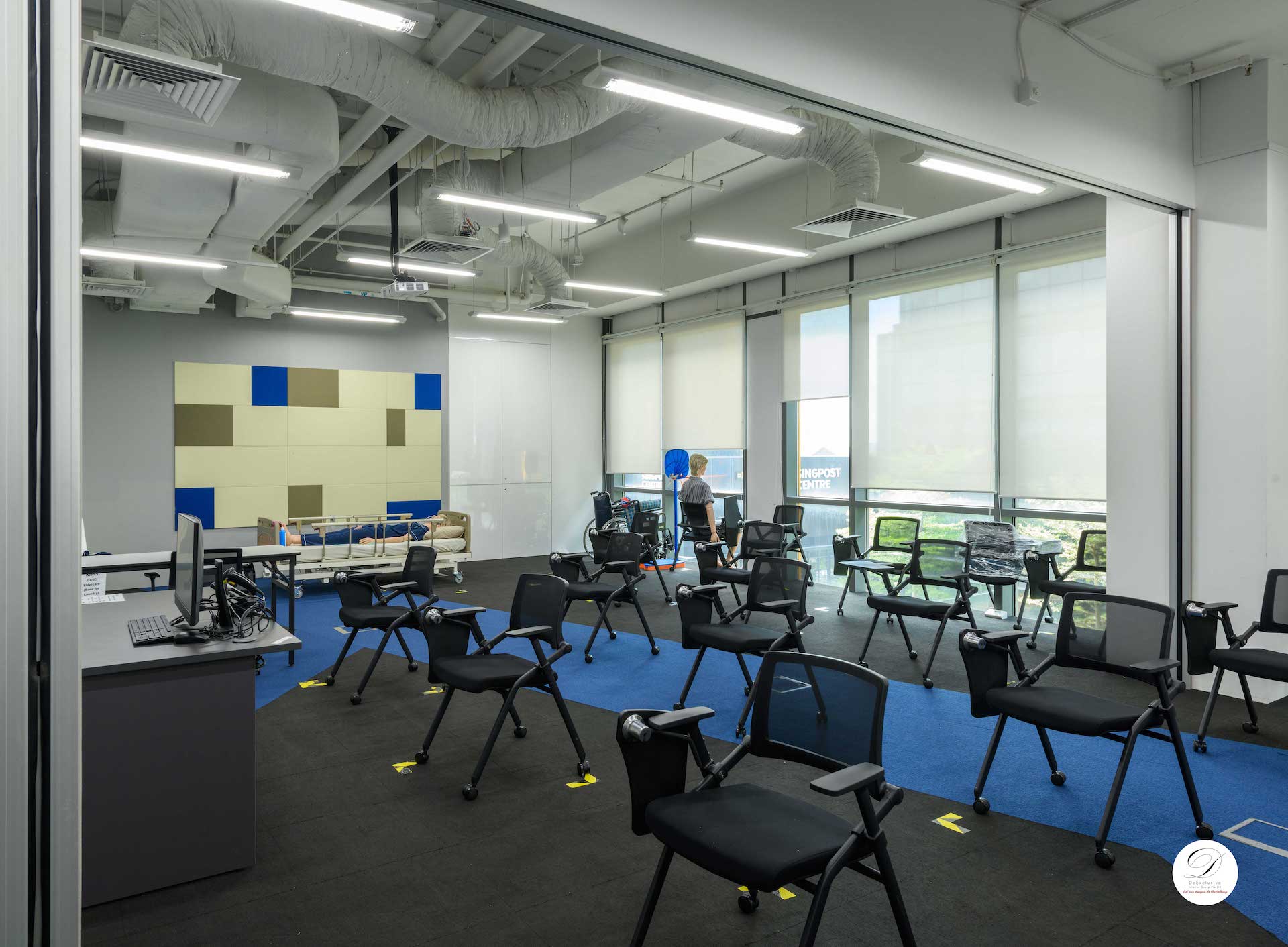
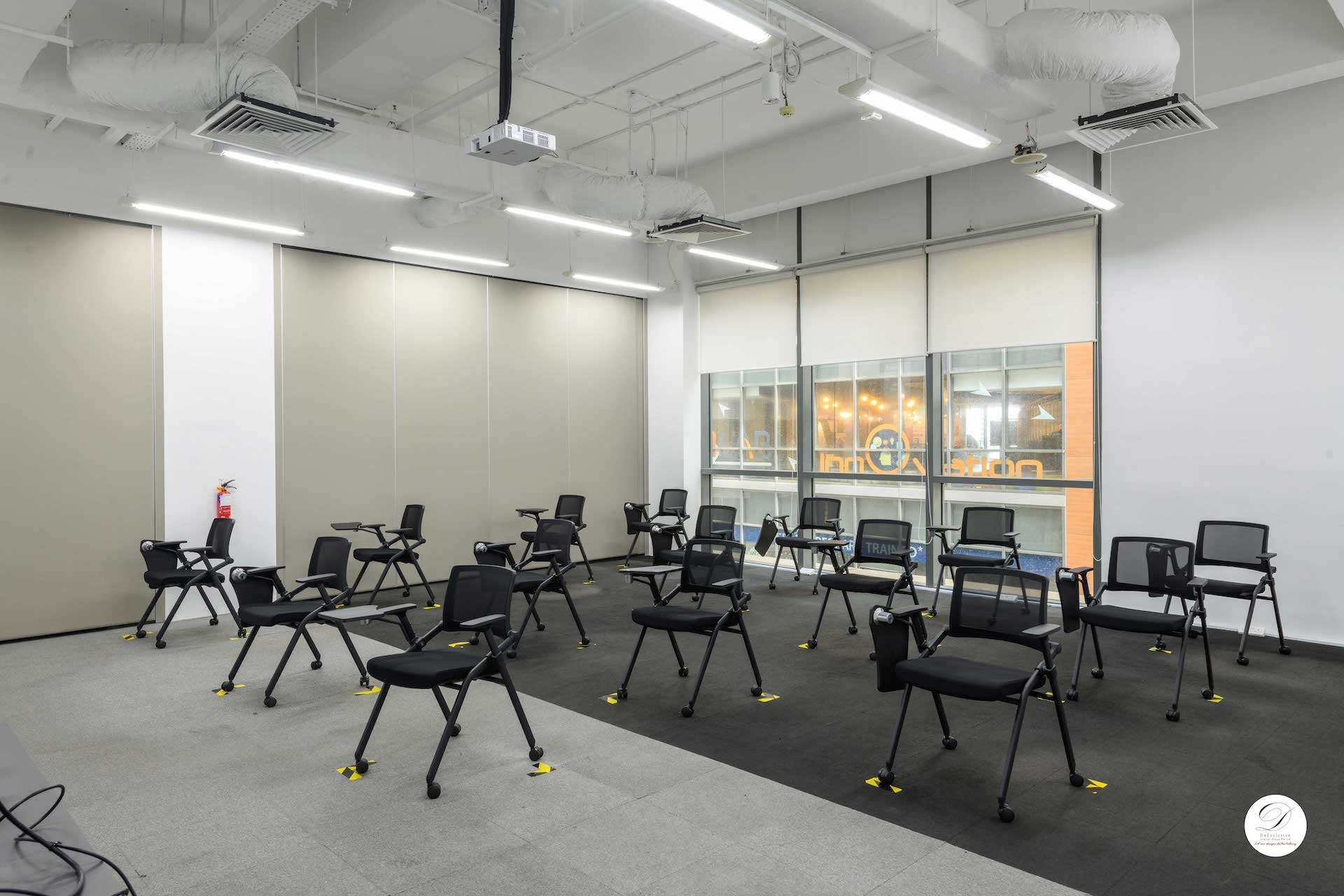
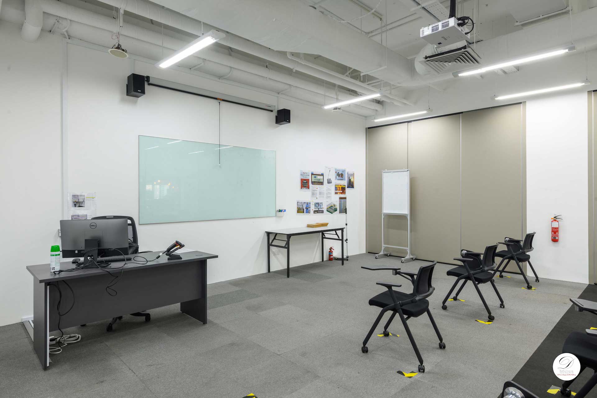
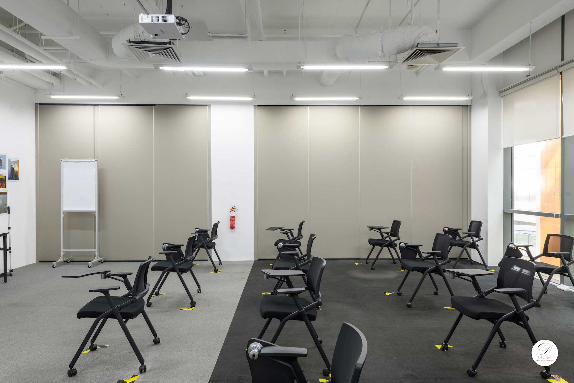
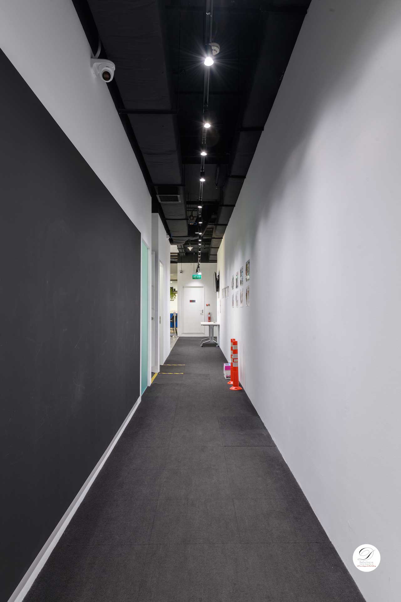
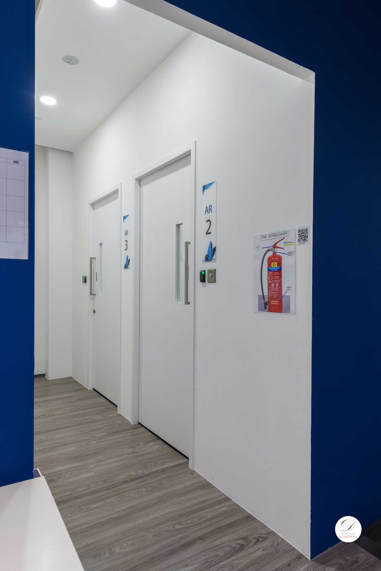
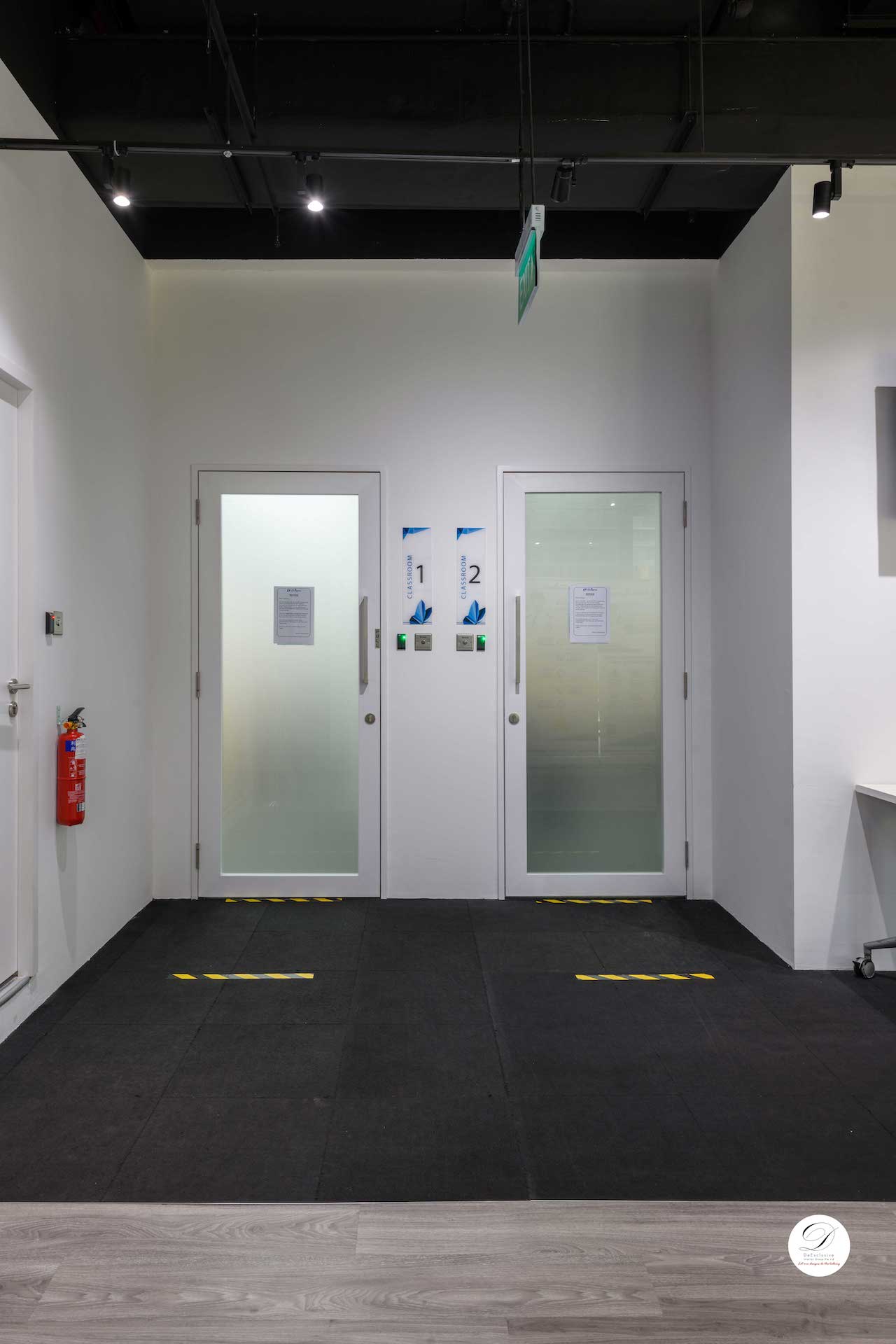
In our second commercial project with NTUC Learning Hub, Senior ID Nicole visualised a space that uses a lively combination of blue and white with greenery for an uplifting interior. Nicole expertly executed the design to bring minimalist with modern sophistication. By using white as the predominant colour, it gives the area a sense of freshness and clarity. White also helps to balance out the bold combination of blue. The result is a refreshing contrast and evokes an energised and cheerful character in this commercial space.
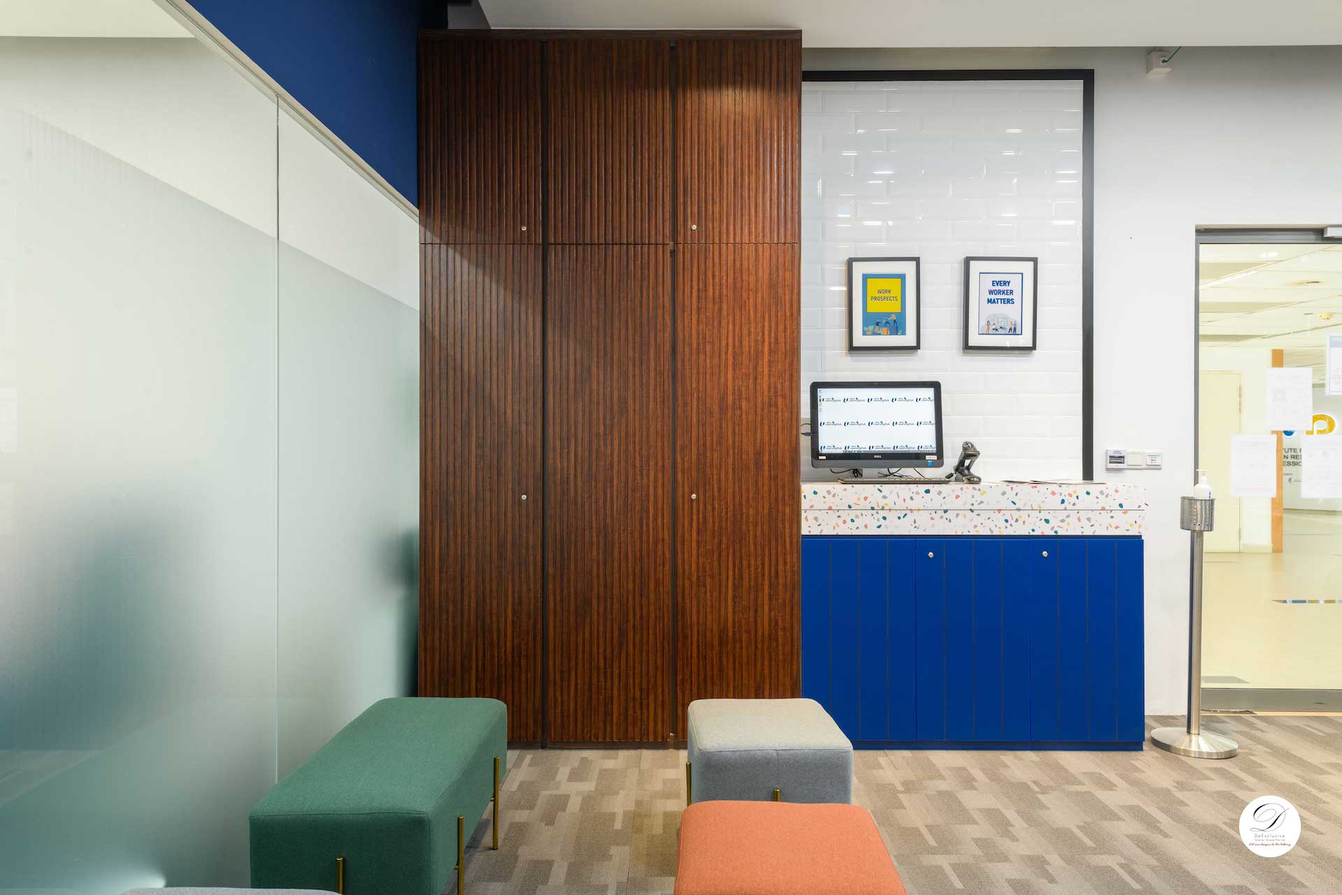
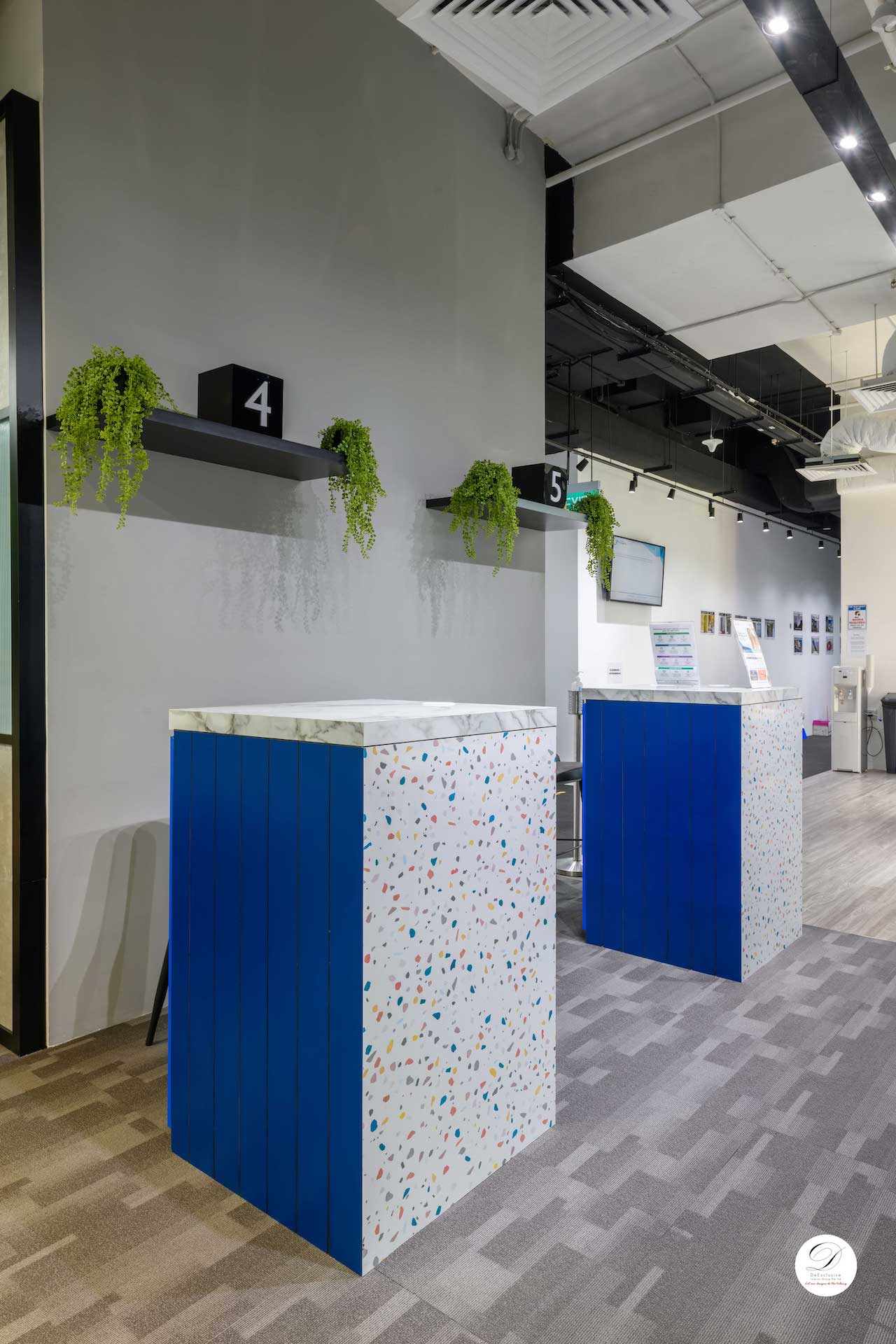
An expansive and airy double-height space promotes a positive and modern outlook. Although the overall look is cohesive, the design in this well-curated space subtly showcases the separation from the reception, work to the learning area. Greenery used throughout from the entrance to the reception area helps lighten the mood and add visual interest. Don’t miss details such as wood panelling feature walls and terrazzo textures that add fun and character to this Learning Hub.
Take a photo tour through this NTUC Learning Hub and see how Nicole’s approach broke the norm of traditional commercial spaces.

